
Color separation for screen printing is the essential process of dividing a design into distinct ink layers that print in sequence to recreate the image on fabric, enabling precise color control, cleaner edges, and reliable results across many runs. When done well, it yields clean edges, accurate color reproduction, and reliable registration across multiple print runs, while also minimizing misregistration, color drift, and ink bleed during production. This introductory guide walks you through the core concepts, common methods, and a practical workflow you can apply to both simple graphics and complex multi-color artwork, from initial sketch to final mockups. Whether you are a hobbyist apparel creator or a professional shop operator, mastering this technique is essential to produce vibrant, durable garments that meet brand standards. By understanding the right tools and techniques, you can reduce trial and error and speed up production while maintaining quality and consistency across batches.
Think of color separation as planning multiple ink channels rather than one static image, a mindset that aligns with modern print workflows. In practice, designers break down artwork into channels or plates, using CMYK color separation for process color blends or reserving spot colors for logos and metallics. Halftone color separation techniques, a form of color separation for screen printing techniques, translate continuous tones into printable dot patterns, preserving detail while keeping ink usage manageable and consistent across runs. For consistent results across fabrics and presses, consider screen printing color management and a well-defined color separation workflow for screen printing to align with production standards. By adopting a structured workflow and clear naming conventions, shops can maintain accuracy, repeatability, and efficient turnaround on diverse designs.
Foundations of Color Separation for Screen Printing: Key Concepts and Color Models
Color separation for screen printing techniques rests on a few core concepts that determine how a design will be rebuilt with ink on fabric. The most common model for textiles is CMYK (cyan, magenta, yellow, and black), which, along with additional spot colors for logos or special effects, shapes how you allocate inks across layers. Understanding when to use CMYK, spot colors, or a mix helps balance opacity, color accuracy, and ink consumption. Halftone methods also come into play here, converting continuous tones into tiny dots to reproduce shading with a limited number of screens. Proper halftone control—dot size, frequency, and angles—helps preserve detail and reduce moiré while keeping production efficient. Finally, the separation workflow itself emerges from planning color counts, assigning inks to layers, and preparing print-ready films or digital mocks.
In addition to these fundamental ideas, a well-considered underbase strategy often drives the overall success of a color separation. On dark fabrics, a white underbase can dramatically improve color brightness and opacity, though it adds one more layer to manage in the separation. The interplay between the color model, halftone approach, and underbase availability defines the path from artwork to print-ready files. When you combine these elements with a thoughtful workflow, you set the stage for clean edges, reliable registration, and vibrant, durable garments—the hallmarks of effective color separation for screen printing techniques.
CMYK Color Separation vs. Spot Colors: Balancing Process Hues and Brand Colors
A core decision in any color separation is whether to reproduce with CMYK process colors, rely on spot colors, or blend the two. A pure CMYK color separation uses four or more screens to approximate a full-color image, while spot colors preserve exact brand hues, metallics, or effects that are difficult to reproduce with process colors. Many shops blend CMYK with spot colors to achieve both broad color coverage and precise branding, which can help control ink usage, opacity, and color fidelity. This balance is a practical application of the color separation workflow for screen printing, where you plan ink counts and layer assignments before production begins.
Understanding the trade-offs between CMYK color separation and spot colors also informs screen printing color management. For example, purely CMYK work may require tighter halftone control and more careful color matching across runs, whereas spot colors can simplify edge handling for logos or metallics. By mapping which design elements will use process colors versus spot colors, you can optimize registration, ink layering, and overall print quality while keeping production efficient and predictable.
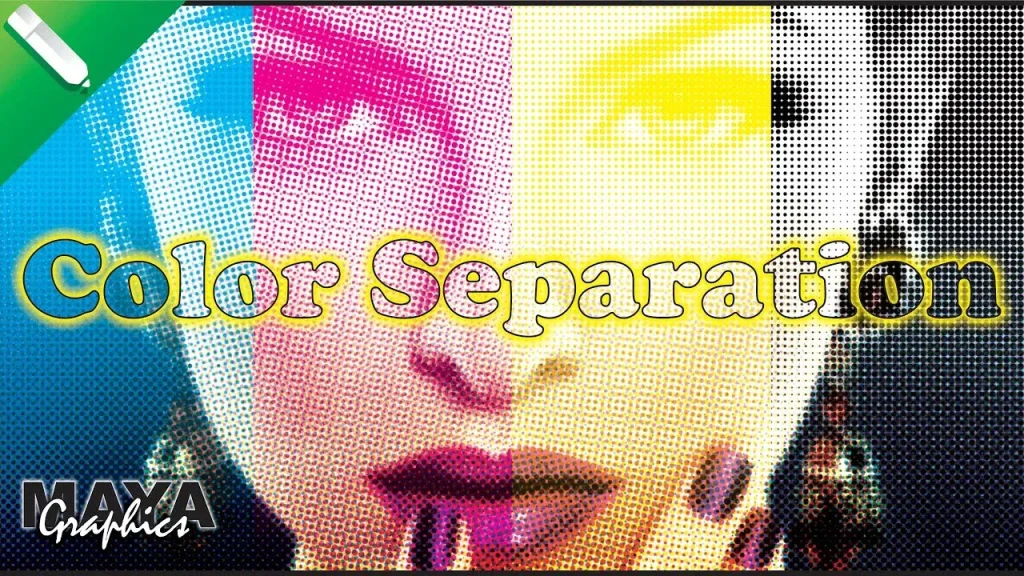
Halftone Color Separation: Dots, Frequency, Angles, and Texture Control
Halftone color separation is a foundational technique for reproducing gradients and shading with a limited color palette. The size and spacing of the halftone dots—together with screen frequency and angular arrangement—determine perceived color and texture on the garment. Thoughtful halftone planning helps maintain detail while keeping ink counts manageable and avoiding excessive screen wear. Selecting appropriate dot patterns is essential for preserving legibility in fine details and ensuring consistent color relationships across layers.
In practice, halftone strategy affects both aesthetics and production efficiency. Different colors may require different dot angles to minimize moiré patterns and color bleed when layered on top of each other. Keeping a coherent approach to halftone settings across color channels helps you retain image clarity, protect print speed, and reduce issues like color drift or edge softening during multiple print passes.
The White Underbase: Underbase Strategies for Color Separation on Dark Fabrics
When printing on dark fabrics, the white underbase plays a critical role in achieving vibrant, true-to-design colors. The underbase sits beneath other inks to improve opacity, suppress color bleed, and boost brightness. However, introducing an underbase adds another layer to separate, so plan ink counts and registration carefully to avoid overprinting or increased drying time. A well-planned underbase helps ensure that subsequent colors pop and that complex artwork remains legible across garment colors.
Effective underbase strategies also influence color consistency across runs. You’ll want to evaluate underbase opacity, its interaction with top colors, and how it affects overall hand feel and wash durability. Properly ordered channels—placing the underbase early in the sequence and aligning it precisely with the printing surfaces—can minimize setup time and improve final results on a range of fabrics.
Color Separation Workflow for Screen Printing: From Artwork Prep to Proofing
The color separation workflow for screen printing begins with a design assessment: identifying brand colors, essential visual elements, and which areas will use spot colors versus process colors. If a white underbase is needed, plan that layer early. As you prepare the artwork, decide how many color channels you’ll need and establish clear, descriptive names for each ink channel. This planning stage aligns with best practices in the color separation workflow for screen printing and helps streamline the rest of production.
Next comes creating color channels, establishing halftone settings, and producing proof sheets or digital proofs. Output films or digital separation files should be clearly labeled and matched to their corresponding inks on the press. Printing a test garment is highly recommended to validate color relationships and registration before committing to full production, ensuring the separation remains faithful to the original design.
Color separation for screen printing: Software Tools and Best Practices for Consistent Screen Printing Color Management
Software tools are central to efficient color separation for screen printing, whether you work with manual separation or software-assisted workflows. Vector programs are often ideal for clean edges and scalable color areas, while raster editors handle shading and texture. Separation plugins or stand-alone software can enforce consistent color counts, screen angles, and halftone settings across similar designs, supporting a robust color separation for screen printing techniques.
To maintain long-term consistency, establish a standard color palette, document your workflow, and test across fabrics. Clear naming conventions, a universal color library, and formal QC checks at each stage help reduce guesswork and misregistration. By integrating these practices with a disciplined workflow, you can deliver repeatable, high-quality prints while adapting to different garment types, inks, and customer needs.
Frequently Asked Questions
What is color separation for screen printing techniques, and how does it impact edge clarity and registration?
Color separation for screen printing techniques refers to splitting artwork into separate ink layers that the press applies in sequence. When done well, it yields clean edges, accurate color reproduction, and reliable registration across multiple runs. The separation process involves choosing CMYK colors and/or spot colors, planning halftone settings, and allocating an appropriate white underbase when printing on dark fabrics. This planning reduces surprises on press and helps you pre-empt misregistration.
How does CMYK color separation work in screen printing, and when should you add spot colors for branding or effects?
CMYK color separation in screen printing uses four process colors across separate screens to recreate a full-color image. You can add spot colors for exact branding hues or metallic effects that aren’t easily reproduced with process colors. Many shops blend CMYK with one or more spot colors to balance ink usage, opacity, and color accuracy. Proper planning includes assigning inks to layers and setting halftone or underbase strategies.
What is halftone color separation, and how do you control dot size, frequency, and angles to preserve detail?
Halftone color separation in screen printing converts continuous tones into tiny dots printed with different sizes and frequencies. Controlling dot size, frequency (screen ruling), and angles helps maintain detail and reduce moiré while keeping ink counts manageable. Consistent halftone settings across colors also improve color separation predictability during proofs and on the press.
What role does screen printing color management play in the color separation workflow for screen printing, and how do you ensure consistency across runs?
Screen printing color management ensures that colors stay consistent from design to print. It involves standardizing palettes, calibrating the press, and validating proofs, all within the color separation workflow for screen printing. By documenting channel order, screen angles, halftone rules, and underbase strategies, shops achieve repeatable results across runs and fabrics.
Can you describe a color separation workflow for screen printing when handling complex multi-color artwork?
A practical color separation workflow for screen printing starts with design assessment, then artwork preparation, channel creation, halftone setup, proofing, and output to films or digital separations. For complex multi-color art, plan color counts, decide which colors become spot colors, and create clearly named layers for each ink. This workflow minimizes surprises on press and helps ensure accurate registration and color relationships.
What are common challenges in color separation for screen printing techniques, and how can you mitigate misregistration and color drift?
Common challenges in color separation for screen printing techniques include color drift, misregistration, muddy colors, and underbase problems. Mitigate these by calibrating the press, using registration marks, planning traps where colors meet, and tightening color separation limits. Document standards, test across fabrics, and perform on-press checks to maintain quality across runs.
| Aspect | Key Points |
|---|---|
| Overview | Color separation for screen printing divides a design into distinct ink layers printed in sequence to reproduce the full image on fabric, yielding clean edges, accurate color reproduction, and reliable registration across multiple print runs. |
| Color models | CMYK (cyan, magenta, yellow, black) with additional spot colors; some workflows blend CMYK with spot colors to balance ink usage, opacity, and color accuracy. |
| Halftone | Halftone converts shades into tiny dots; dot size, frequency, and angles affect color and detail while reducing moiré. |
| Underbase | A white underbase on dark fabrics improves opacity and brightness but adds an extra layer to manage in the separation workflow. |
| Artwork preparation | Prefer vector art; map color layers, name separations clearly, and plan for trapping and edge handling to ensure clean edges. |
| Separation methods | Manual separation offers tight control; software-assisted separation uses tools and plugins to enforce consistent color counts, screen angles, and halftone settings. |
| Workflow steps | Assess design, prepare artwork, create color channels, manage halftones, output proofs, prepare films, and perform press checks. |
| Common challenges | Color drift, misregistration, muddy colors, underbase issues, and edge blurring; mitigate with calibration, proper trapping, and clean vectors. |
| Applications | Beyond basic apparel: metallics, neon colors, discharge inks, foils, and other effects require tailored separation strategies and sometimes additional layers. |
| Best practices | Maintain a standard color palette, document the workflow, test across fabrics, and enforce quality control at every stage. |